Metacorp
Branding | Web Design | Brand Marketing
About the client.
Metacorp is founded by a group of pastors who specialize in corporate development. A tent-making business, built to support their ministry.
Developing the Brand Identity.
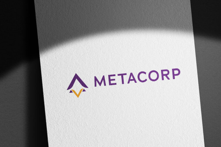
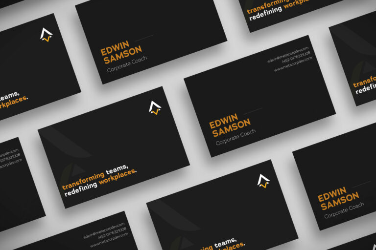
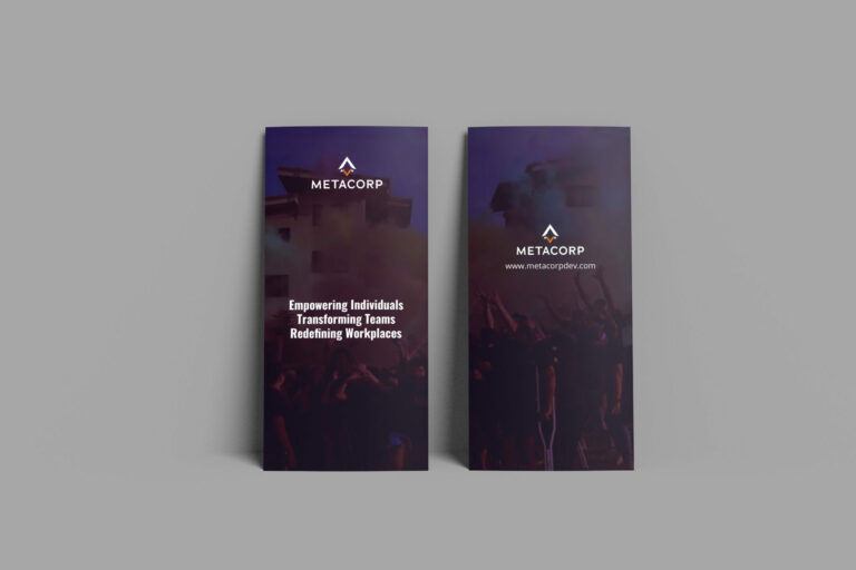
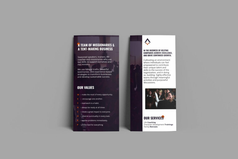
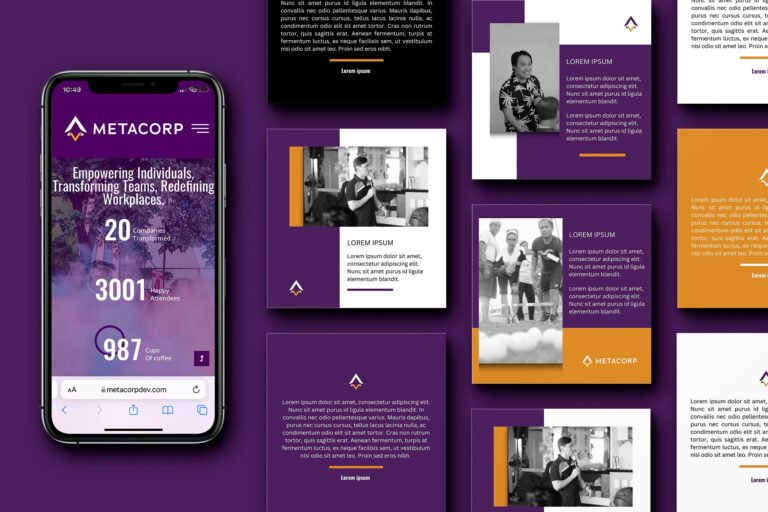
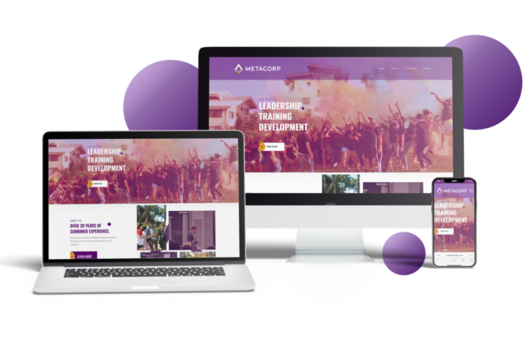
The logo features a minimalist design representing a team building company with a vibrant combination of purple and orange colors. At the heart of the logo is the rocket symbol crafted in a simple yet elegant style. it appears in purple, symbolizing creativity and leadership; taking flight in orange, symbolizing progression, achievement, and the company’s focus on helping teams reach new heights.
The minimalist approach of the logo highlights the company’s emphasis on simplicity and efficiency in achieving team building goals. The clean lines and well-balanced composition create a sense of harmony and unity, representing the company’s commitment to fostering strong teamwork. The striking colors of purple and orange add energy, enthusiasm, and a modern touch to the overall design, making the logo memorable and visually appealing.
